Gallery
First Light Map
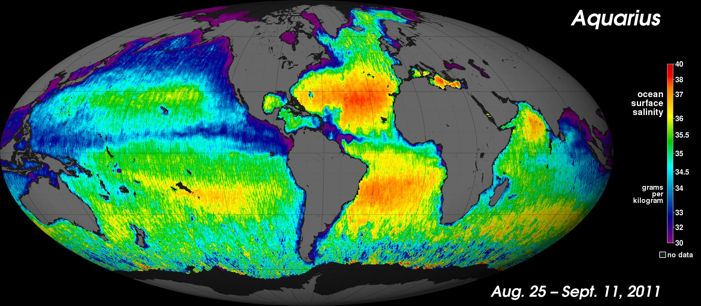
[11-Sep-11] This is NASA's first map of global ocean surface salinity, a composite of the first two and a half weeks of data after the Aquarius instrument became operational on August 25, 2011. The numerical values represent salt concentration in parts per thousand (grams of salt per kilogram of sea water). Yellow and red colors represent areas of higher salinity, with blues and purples indicating areas of lower salinity. Areas colored black are gaps in the data. The average salinity of the global ocean is about 35 (parts per thousand). Credit: NASA/JPL-Caltech/GSFC.View: Click on the image to enlarge. Click on the Escape key or anywhere outside the shadowbox to close.
Download: To download a copy, right click on the image and select Save Image As (on a Mac keyboard, click the touchpad while holding down the Control key). To download the highest resolution in our database, first click on the image to enlarge and then save that version.