Gallery
Long-Term Composite Image: 25-Aug-11 to 07-Jul-12
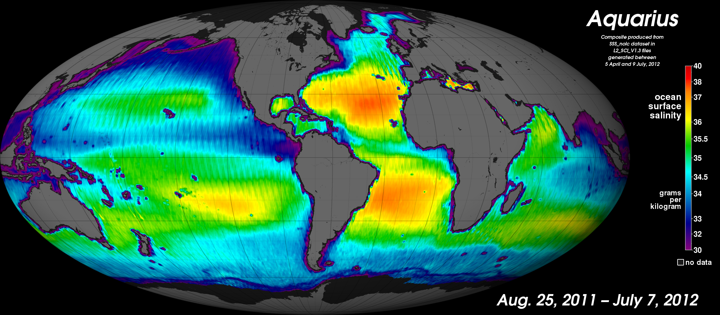
[12-July-12] Sea surface salinity data taken by the NASA Aquarius instrument during its first 10 months of operation. Reds show higher salinity (40 grams per kilogram) and purples show relatively low salinity (30 grams per kilogram). Preliminary (Version 1.3) data contain uncertainties and, over time, will be updated as further calibration and validation work are completed. Data on these images in the southernmost ocean regions are not yet reliable as they are associated with high winds and low surface temperatures. The north-south striped patterns are artifacts of small residual calibration errors and thus are not real. Low salinity values immediately adjacent to land and ice-covered areas are due to proximity to coastlines or ice edges, which introduces errors into the data. The maps show several well-known ocean salinity features such as higher salinity in the subtropics; higher average salinity in the Atlantic Ocean compared to the Pacific and Indian oceans; and lower salinity in rainy belts near the equator, in the northernmost Pacific Ocean and elsewhere. These features are related to large-scale patterns of rainfall and evaporation over the ocean, river outflow and ocean circulation. Credit: Norman Kuring, NASA GSFC.
View: Click on the image to enlarge. Click on the Escape key or anywhere outside the shadowbox to close.
Download: To download a copy, right click on the image and select Save Image As (on a Mac keyboard, click the touchpad while holding down the Control key). To download the highest resolution in our database, first click on the image to enlarge and then save that version.