Gallery: Climatology
Climatology Maps of Aquarius Data (V5)
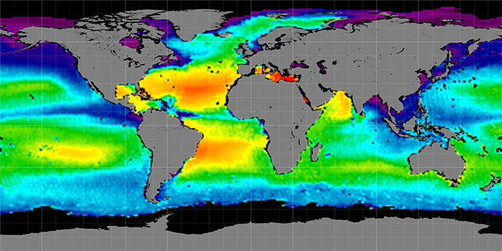
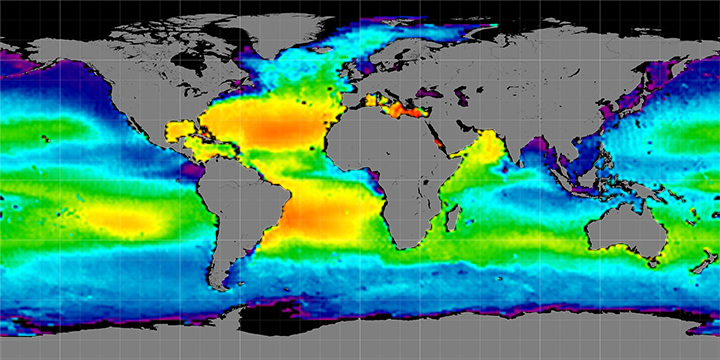
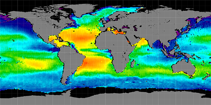
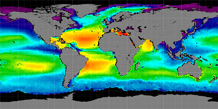
These composite maps show global sea surface salinity averaged by month and by
season. Click on the images (below) for a closer view.
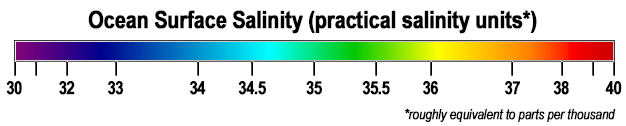
In these maps, reds show higher salinity (40 grams per kilogram) and purples show relatively low salinity (30 grams per kilogram).
V4 is based on the latest algorithms developed by the Aquarius Calibration/Validation working group. These maps are produced using software written by Joel Gales, John Wilding, and others at NASA Goddard Space Flight Center.
Monthly Climatology Maps
 January Months 2012-2015 | 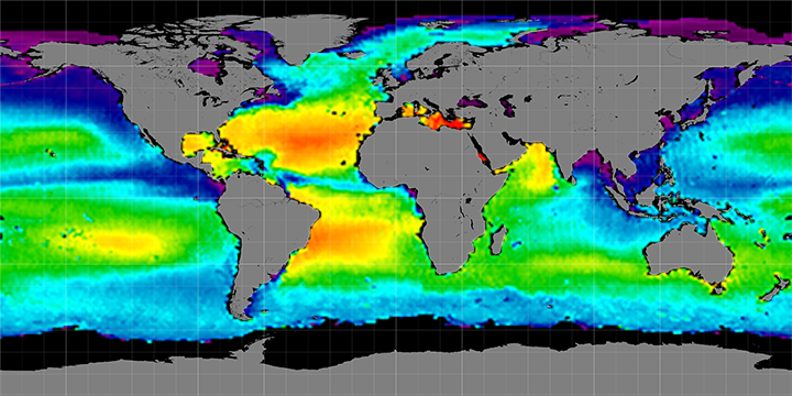 February Months 2012-2015 |  March Months 2012-2015 | 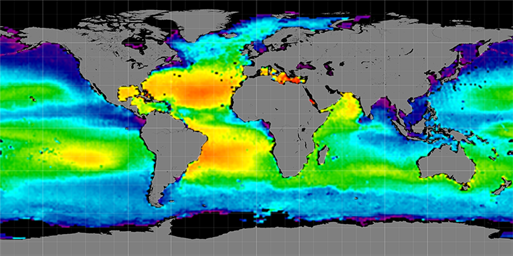 April Months 2012-2015 | |||
 May Months 2012-2015 |  June Months 2012-2014 | 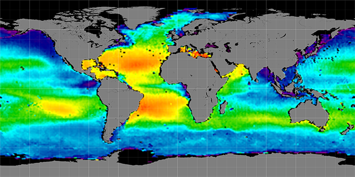 July Months 2012-2014 | 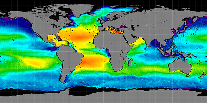 August Months 2011-2014 | |||
 September Months 2011-2014 | 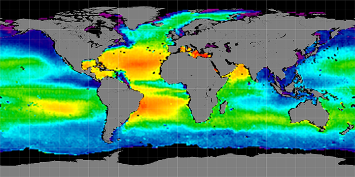 October Months 2011-2014 | 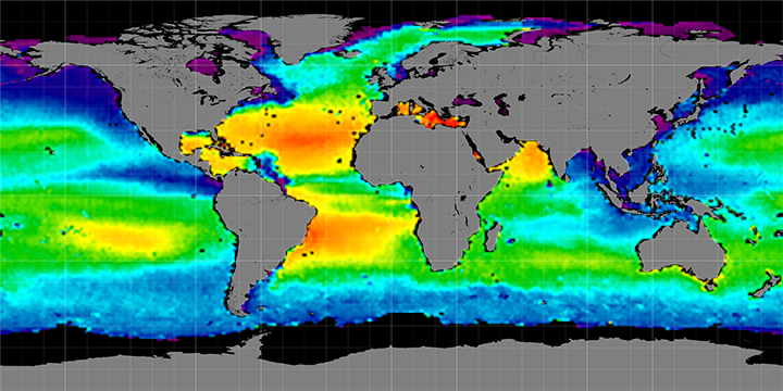 November Months 2011-2014 |  December Months 2011-2014 | |||
Seasonal Climatology Maps
 Summer Months 2011-2014 | 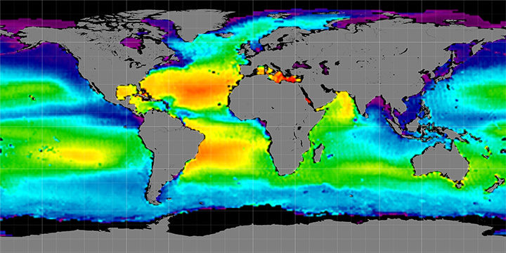 Autumn Months 2011-2014 |  Spring Months 2012-2014 |  Winter Months 2011-2015 |