Gallery: Sea Surface Salinity
Composite Maps of SMAP Data (V2.0): Northern Hemisphere
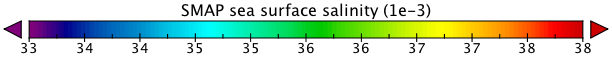
These maps are generated from Version 2.0 (V2.0) of the SMAP sea surface salinity Level-3 (mapped) data. The monthly averaged data are gridded at 25 x 25 km (15.5 X 15.5 mi) resolution. They show a range of salinities from 33 to 38 using the Practical Salinity Scale (PSS; Lewis, 1980), which is roughly equivalent to parts per thousand. PSS and PSU (Practical Salinity Units, which is also used) are different names for the same thing.
Dark blues and purples represent lower salinities while reds show areas of higher sea surface salinity. It is important to note that the color scale used for the V2.0 SMAP salinity maps is not the same as the one used for Aquarius Version 4.0 maps. There are plans to implement a consistent color scale between these maps in conjunction with Aquarius Version 5.0 processing.
Dark blues and purples represent lower salinities while reds show areas of higher sea surface salinity. It is important to note that the color scale used for the V2.0 SMAP salinity maps is not the same as the one used for Aquarius Version 4.0 maps. There are plans to implement a consistent color scale between these maps in conjunction with Aquarius Version 5.0 processing.
Slideshow: Monthly composite maps of sea surface salinity in the northern hemisphere (hover over images to view date or pause the slideshow)
Click here to view a slideshow of the southern hemisphere. Mollweide projections are available here.